

Top 10 Jersey Lineups for the 2020-21 NHL Season (THW)
0
8
Starting in the 2020-21 season, all 31 NHL teams will wear a reverse retro themed jersey for select games. With the recent release of these jerseys, there has been a lot of talk concerning which jerseys look the best and which ones missed the mark. With all the recent hype over the reverse retros, there hasn’t been a lot of talk on how the new uniforms fit in with the rest of a team’s jersey lineup. The following is a list of the top 10 jersey lineups in the league for 2020-21. This includes home, away, alternate, and reverse retro jerseys combined into one ranking.
The ranking is based on a few factors. First and foremost, the looks. This is the most important thing when it comes to jerseys, both on and off the ice. The second factor this ranking is based on is creativity. This is compared both to what other NHL teams are doing, as well as the other jerseys from the same team and how different they are. The choices a team has when it comes to creativity also affects the rankings. If a team has only had one or two logos in the history of the organization, they can’t be penalized as much for not being more creative.
The third factor that is being considered for the ranking is historical significance. Even if a jersey doesn’t look the best by modern-day standards, if it has historical importance to the team, it is an important component to consider. The last portion of the ranking is based on how the lineup fits together. While there should be creativity, the three or four jerseys that the team uses should look good together.
This is the least important factor, as a team only wears one jersey at a time, but it is something to take into account. The following ranking is also based on the team’s current jersey lineup as of November 2020. Unless a team has specifically discontinued a jersey, it is being factored into this list.
10: St. Louis Blues
The Blues’ home and away jerseys are simple and clean, featuring the music note logo, incorporated into every jersey in the team’s history. White and yellow stripes line the sleeves, shoulders, and bottom of the jersey. Navy blue accents complement the lighter shade of blue featured in the rest of the home jersey, and on the away jersey’s shoulders.
 Justin Faulk, St. Louis Blues (Photo by Keith Gillett/Icon Sportswire via Getty Images)
The Blues’ alternate jersey is widely considered one of the best third jerseys in the league. The light blue base is reminiscent of the color the team wore when they first came into the league, from 1967-1973. Thick yellow stripes fall across the sleeves and bottom of the jersey, with thin white lines above and below the yellow. A thin yellow stripe also lines the collar. Similar to the home and away jerseys, the alternate uniform is simple, yet it is a classic jersey.
Considering how few options the team had when designing their reverse retro jersey, I think they blew it out of the park. Despite some mixed reactions, it differentiates itself from the rest of the lineup while also not looking out of place. The base red is bolder than any other Blues jersey, and a few details on this jersey makes it stand out even more. The logo itself is a bit different, as it is a rounder style of the note, and it says, “St. Louis” at the top.
The striping on the reverse retro jersey is also phenomenal. There are thin yellow lines, replicating a music staff, atop a thicker yellow stripe. This sits above the blue bottom of the jersey. Yellow and blue striping also surrounds the collar. There’s also a secondary logo that serves as a shoulder patch. This logo is a trumpet, surrounded by a circle with the team name written around it.
9: Calgary Flames
Over the 2020 NHL offseason, the Flames made the decision to replace their home and away jerseys with their retro alternate jersey. This was a great decision, as they now have some of the best home and away jerseys in the NHL. The new primary jerseys have colors to match the first ones the team ever wore, from 1980-1994.
The home jersey is a bright red with prominent yellow and white striping on the sleeves and bottom of the jersey. There is also a yellow collar to finish out the design. The logo, the signature “C” with flames, on the home jersey is white with a yellow outline. The away jersey is the same except with red where there was white before. The color scheme matches the Flames’ team name perfectly.
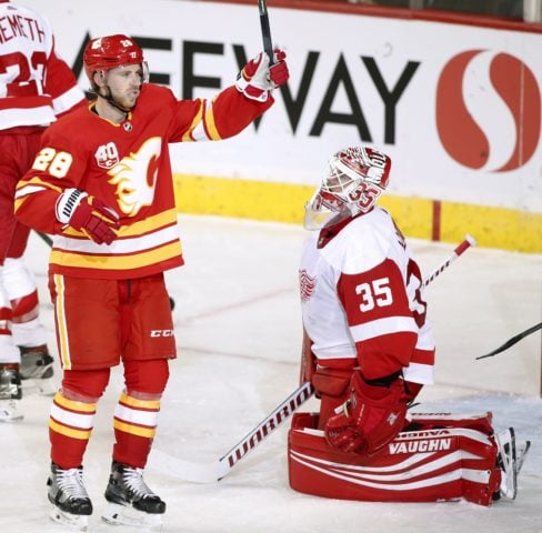 Calgary Flames center Elias Lindholm celebrates his goal in front of Detroit Red Wings goalie Jimmy Howard (THE CANADIAN PRESS/Larry MacDougal)
The deep red home jersey the team used prior to switching to the new uniforms will serve as the Flames’ alternate jersey for the coming season. The logo on this jersey is black with a white and yellow outline. There is also yellow and white striping on the bottom to match. The sleeves and sides of the jersey are black, with more yellow and white striping cutting through. The collar is also black on this jersey. There are two shoulder patches, one with the Canadian flag and one with the flag of Alberta.
The Flames did a masterful job with their new reverse retro, bringing back Blasty the horse from 1998-2006. This jersey is super clean with the solid black base, adding yellow and red diagonal striping on the sleeves and bottom. Blasty is mainly yellow, with white and black accents. He also has red flames shooting out of his nose, which looks pretty cool. The shoulder patch on this jersey is the logo from the team’s home jersey.
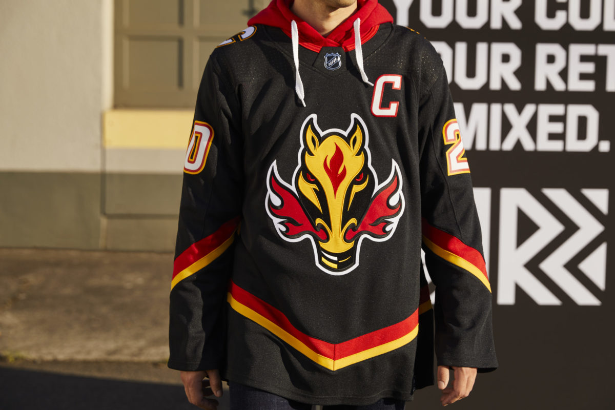 Calgary Flames Reverse Retro jersey (NHL/adidas)
The Flames have a great jersey lineup going into the 2020-21 season. Everything fits well together, yet the Blasty jersey still stands out. For me, the biggest issue is the team keeping the old home jersey as an alternate, rather than retiring it. It doesn’t look nearly as good as the primary home jersey, and it is too similar to add value to the lineup. This doesn’t take away from the other three spectacular jerseys the team will be sporting in the coming season.
8: Ottawa Senators
Starting in the 2020-21 season, the Senators are returning to the old 2-D logo style, along with new jerseys. These new jerseys are a step up from the old ones, and overall, they look really nice. The base color for the home jersey changed from red to black, which looks much better. There are thin red stripes on the sleeves with a black stripe in between, a red collar, and a thicker red stripe along the bottom. The shoulder patch features a simple circular logo with an “S” in it. The signature soldier is surrounded by a red and gold circle as the primary logo. The away jersey is identical except the base is white rather than black.
The reverse retro jersey is the same concept, just with a different base color. The Senators use red as the base color for their reverse retro jersey, emulating the red jerseys they previously wore. The logo and shoulder patch are the same, and only the striping is different on the third jersey. There are thin black stripes on the sleeves and collar, with a thicker black stripe near the bottom of the jersey.
While it is usually better for a team to have a little bit of differentiation amongst their jersey lineup, the three Senators jerseys simply look right together. They all look very sleek, and the drastic change in base color makes them look different enough. The team only has three jerseys rather than four, which makes the lineup look better as well. It’s also not like the team had a whole lot to choose from. They could have gone back to the “O” jersey, but I personally believe the current primary logo looks significantly better. One thing is for certain; the Senators should never go back to the “Sens” logo they used from 2008-2011.
7: Vegas Golden Knights
The Golden Knights have some mixed opinions when it comes to their jerseys, but there is no doubt that they are some of the most unique in the NHL, pushing them into this list. The home jersey starts with a dark grey base, with part-black sleeves. There is also a gold stripe and a thinner red stripe on the sleeves. On the bottom of the jersey, there is a thin gold stripe with a thicker black stripe. The collar is also lined in black.
 Nick Cousins, Vegas Golden Knights (Photo by Ethan Miller/Getty Images)
The secondary logo and shoulder patch feature the star found in the “Welcome to Fabulous Las Vegas” sign, with two swords crossing through it. The team’s primary logo is one of the most detailed in the league. The base is a gold-lined black shield. The helmet of a knight is found on top of the shield, colored in gold and grey. The cutout of the helmet is in a “V” shape for “Vegas.” The away jersey is identical, except for the white base, and grey replacing where there was black on the home uniform.
The Golden Knights recently introduced an alternate jersey that they will wear starting in 2020-21. The alternate jersey is most like the away jersey, but everything that was white becomes metallic gold and vice versa. This is super flashy, and it screams “Las Vegas.” For me, this is why it should be considered a good jersey. A jersey should not only look good, but the design should match the city of the team, and the Golden Knights did just that with their new alternate uniform.
Though not everyone likes all of the Golden Knights jerseys, they have a great look considering where the team is located. The NHL rarely does anything different when it comes to jerseys and logo design, so the one team that does stand out deserves a place in the top 10.
6: New York Rangers
The Rangers have one of the simplest jersey designs in the league, yet it should be considered one of the best. It is clean, classic, and there is not much to complain about. The team’s home jersey is a blue base with red and white striping on the sleeves and bottom of the jersey. The logo is quite simple, as it is just the “Rangers” wordmark going diagonally down the uniform in red.
The away jersey is pretty similar with a few minor tweaks. The jersey is white with red and blue striping on the sleeves, and on the bottom of the jersey. There are blocks of blue on the bottom of the sleeves and on the shoulders as well. There is more red and white striping that goes through the blue shoulders.
 Ryan Strome, New York Rangers (AP Photo/Frank Franklin II)
The team went with what the fans wanted for the reverse retro, and it looks quite good. The Rangers will wear the Lady Liberty jersey the team wore from 1996-2007. The base is navy blue with red and grey striping on the sleeves. As the name implies, the logo features the head of the Statue of Liberty, which sits over the outline of the shield logo the team wore from 1976-1978. “NYR” is also written out on the bottom of the logo. The shoulder patch is a more modern version of the shield logo that reads “New York” across the top, and “Rangers” diagonally down. The jersey is a bit simple for my taste, but they executed the basics well.
5: Los Angeles Kings
The Kings have basic jerseys, yet they are some of the best, in my opinion. Their home jersey starts with a black base, with white and thin grey striping on the sleeves. There are also thin grey stripes on the bottom of the sleeves, with thin grey and white stripes on the bottom of the jersey. The collar on the home jersey is surrounded by grey, and there is a subtle grey pinstripe that goes along the sleeves and top of the uniform. The team’s logo is pretty simple, with the “LA” wordmark on the top and the crown on the bottom.
 Kale Clague, Los Angeles Kings (Photo by Juan Ocampo/NHLI via Getty Images)
The away jersey is very similar with a white base. Black replaces anything that was grey or white on the home jersey. There is also thicker grey and black striping on the bottom. The Kings also wear an alternate jersey that has a grey base. There are thick black stripes on the sleeves and bottom of the jersey with black shoulders. There’s also a touch of purple inside the collar with the throwback crown logo.
Last season, the home, away, and alternate jerseys that the team wore were somewhat boring, even though they did look quite good. The Kings decided to bring some life into their jersey lineup with the reverse retro. This jersey is incredible, combining the original color scheme of purple and gold which the team wore from 1967-1988 with the logo from the Wayne Gretzky era, which the team wore from 1988-1998. The purple base gets yellow and white striping on the sleeves, as well as a yellow collar. The logo reads “Los Angeles” in a smaller font, atop the “Kings” that centers the logo. There is also a small version of the crown logo beneath the writing.
4: Colorado Avalanche
The Avalanche have some of the best home and away jerseys in the NHL. The home jersey starts with a maroon base with a blue bottom and blue shoulders that go down the sleeves. There are silver stripes that line the sleeves, collar, and bottom of the jersey. The shoulder patch features the “C” from the flag of Colorado in maroon.
What really makes the team’s jersey is the outstanding logo. The logo starts with a maroon “A” with a puck followed by an avalanche sweeping through the letter. The away jersey is identical to the home jersey with a white base, and marron where there was blue. The collar is also lined with blue on the away jersey.
 Vladislav Namestnikov, Colorado Avalanche (Photo by Michael Martin/NHLI via Getty Images)
While the Avalanche’s alternate jersey is most fan’s least favorite of the lineup, I don’t think it’s too bad. The old Colorado Rockies jerseys were quite nice, and many wanted to see a throwback for the alternate. The team sort of did that, which is why some are not a fan of this uniform. It starts with a dark blue base, white striping, and a thin white stripe along the bottom. The lower part of the sleeves is maroon on this jersey as well. The shoulder patch is the Colorado flag on this jersey. The primary logo is the same mountain logo with the “C” that the Rockies used, but in colors to match the rest of the jersey. If the organization went full throwback with the correct colors, more people would like this uniform.
The Avalanche really made up for the alternate jersey with their new reverse retro that they will wear starting in 2020-21. It is a white base with maroon stripes along the bottom of the jersey and sleeves. The collar is also matching in color. The logo is a throwback to the Quebec Nordiques in the maroon and blue that the Avalanche usually rock. There is also fleur-de-lis that lines the bottom of the jersey, also in maroon.
3: Montreal Canadiens
As the oldest active team in the NHL, the Canadiens have a lot of pressure put on them when it comes to jerseys. The team’s jerseys should never change significantly, and if they do, a lot of fans will be upset. There has only been one primary logo used for all of the team’s existence, dating back to 1917.
The Canadiens’ current home jersey starts with a red base, with white and blue striping in the middle, on the sleeves, and on the bottom of the jersey. The collar is white with a blue lining. The traditional logo is as simple as they come, as it mainly consists of a “C” in red. Contrary to popular belief, the “H” in the middle of the logo stands for “hockey” and it does not stand for “Habs.” This is because the original name of the team was Club de Hockey Canadien.
The away jersey is a bit simpler, as it is mainly all white. There is red at the bottom of the sleeves and on the shoulder, and there are small red and blue stripes on the bottom of the jersey, as well as the same blue-lined collar on the home uniform. Other than that, there is no excess design on the jersey.
 Josh Brook, Montreal Canadiens (Photo by David Kirouac/Icon Sportswire via Getty Images)
Considering the lack of options the team had to get creative with the reverse retro, I think they did an outstanding job. The new alternate jersey is almost identical to the current home jersey, with a blue base instead of red. Where there was blue on the old jersey, there is red on the retro. The collar is red with a blue liner rather than the white featured on the primary jerseys. The Canadiens’ jerseys have been red for their entire history, so the blue base on the alternate is something new that still honors the history of the team.
2: Florida Panthers
Along with the Avalanche, the Panthers have some of the best home and away jerseys in the league. The home uniform starts with a vibrant red base, with white and gold striping through the middle of the jersey and on the sleeves. Blue is incorporated into the jersey in the collar and in a thin stripe on the bottom of the jersey. There is also the flag of Florida on both sleeves. The logo consists of the head of a panther, with “Panthers” written across the top.
 Lucas Wallmark, Florida Panthers (Photo by Joel Auerbach/Getty Images)
The team’s away jersey is almost identical to the home uniform. The only changes to the white jersey come in the striping. The white on the home jersey becomes red on the away uniform. The Panthers are one of the few teams in the NHL to have a different logo for their home and away jerseys. On the away jersey, “Florida” is written above the head of the panther instead of “Panthers.”
Many have called the Panthers’ reverse retro jersey one of the best in the league, and I agree. The blue throwback jersey, reminiscent of what the team wore from 1998-2011, is stunning. The old leaping panther logo is used on this alternate jersey, with the palm tree logo used as the shoulder patch. The shoulders of this jersey are red, with a gold lining. The bottom of the jersey and sleeves also features a gold lining, with white and red stripes. Florida did a great job with this jersey, as they executed all the basics perfectly, making for a really nice looking uniform.
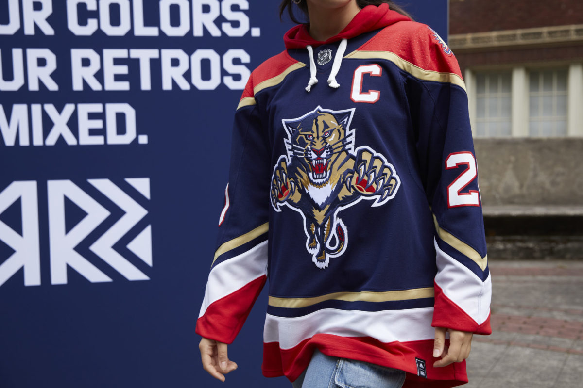 Florida Panthers Reverse Retro jersey (NHL/adidas)All three jerseys that will be worn by the Panthers next season look great on their own and together. There is a good mix of modern and throwback, and there is a good amount of variety in terms of the colors and logos on the jerseys.
1: Arizona Coyotes
For the 2020-21 season, the Coyotes will wear the beloved Kachina Coyote jersey more than they have in previous seasons. The Kachina jersey, along with the Coyotes’ home jersey, will serve as the team’s home uniform for the upcoming season. There will also be two new 25th anniversary logos added to the team’s jerseys.
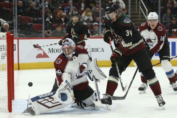 Colorado Avalanche goaltender Pavel Francouz makes a save on Arizona Coyotes center Carl Soderberg. (AP Photo/Ross D. Franklin)
Starting with the home jersey, a maroon base gets black on the upper part of the sleeves, with white and maroon striping near the bottom of the arms. There is also a black collar and a thin black stripe along the bottom of the jersey. The coyote paw logo sits atop the jersey as a shoulder patch. The primary logo is quite simple, as it is the coyote head the team has worn since 2003. The away jersey is identical to the home, but with a maroon stripe on the bottom to go with the white base. There is also a different shoulder patch on the away jersey; an outline of the state of Arizona with “AZ” written across the bottom.
Almost all hockey fans can agree that the throwback Kachina Coyote jersey is one of the best in the NHL. The Phoenix Coyotes wore the jersey from 1996-2003, and the organization brought it back in 2018. The black base gets maroon accents on the bottom of the jersey and on the bottom of the sleeves. There is also green, cream, and maroon detailing above the maroon blocks, as well as a cream lining on the collar. The shoulders are green with a maroon lining, and the shoulder patch is the Coyotes’ moon logo. The centerpiece of the jersey, though, is the logo, and it is ugly in the best way.
With such an amazing throwback jersey already, it was hard to imagine that the Coyotes would be able to come out with something that could even compete with the current alternate. The team delivered, though, bringing back the Coyote head that was worn from 1998-2003. The team replaced the original green with a vibrant purple base, keeping the full desert scene on the bottom of the jersey. There is also a black collar on this jersey, along with a lizard shoulder patch. The primary logo and rest of the jersey are, again, ugly in the best way.
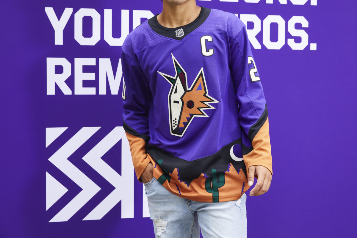 Arizona Coyotes Reverse Retro jersey (NHL/adidas)
The Coyotes’ home and away jerseys are very nice, but it is certainly the team’s alternate and reverse retro jerseys that pushes them to the top of the list. The Coyotes honor the team’s relatively short history, all four jerseys look spectacular, whether it be one of the modern ones or a throwback, and they look great together as a lineup.
The NHL Adds Over 30 New Jerseys for the 2020-21 Season
Though there are always some mixed opinions when it comes to new uniforms, there is no doubt that the league stepped up its jersey game for next season. Teams will get new looks on the ice in the coming season, adding to the excitement for when hockey comes back. Jerseys represent the identity of an organization, and each team will proudly showcase their new uniform lineups when it’s time to get back on the ice.
The post Top 10 Jersey Lineups for the 2020-21 NHL Season appeared first on The Hockey Writers.


https://feeds.feedblitz.com/~/639387...he-NHL-Season/
The ranking is based on a few factors. First and foremost, the looks. This is the most important thing when it comes to jerseys, both on and off the ice. The second factor this ranking is based on is creativity. This is compared both to what other NHL teams are doing, as well as the other jerseys from the same team and how different they are. The choices a team has when it comes to creativity also affects the rankings. If a team has only had one or two logos in the history of the organization, they can’t be penalized as much for not being more creative.
The third factor that is being considered for the ranking is historical significance. Even if a jersey doesn’t look the best by modern-day standards, if it has historical importance to the team, it is an important component to consider. The last portion of the ranking is based on how the lineup fits together. While there should be creativity, the three or four jerseys that the team uses should look good together.
This is the least important factor, as a team only wears one jersey at a time, but it is something to take into account. The following ranking is also based on the team’s current jersey lineup as of November 2020. Unless a team has specifically discontinued a jersey, it is being factored into this list.
10: St. Louis Blues
The Blues’ home and away jerseys are simple and clean, featuring the music note logo, incorporated into every jersey in the team’s history. White and yellow stripes line the sleeves, shoulders, and bottom of the jersey. Navy blue accents complement the lighter shade of blue featured in the rest of the home jersey, and on the away jersey’s shoulders.
Justin Faulk, St. Louis Blues (Photo by Keith Gillett/Icon Sportswire via Getty Images)The Blues’ alternate jersey is widely considered one of the best third jerseys in the league. The light blue base is reminiscent of the color the team wore when they first came into the league, from 1967-1973. Thick yellow stripes fall across the sleeves and bottom of the jersey, with thin white lines above and below the yellow. A thin yellow stripe also lines the collar. Similar to the home and away jerseys, the alternate uniform is simple, yet it is a classic jersey.
Considering how few options the team had when designing their reverse retro jersey, I think they blew it out of the park. Despite some mixed reactions, it differentiates itself from the rest of the lineup while also not looking out of place. The base red is bolder than any other Blues jersey, and a few details on this jersey makes it stand out even more. The logo itself is a bit different, as it is a rounder style of the note, and it says, “St. Louis” at the top.
The striping on the reverse retro jersey is also phenomenal. There are thin yellow lines, replicating a music staff, atop a thicker yellow stripe. This sits above the blue bottom of the jersey. Yellow and blue striping also surrounds the collar. There’s also a secondary logo that serves as a shoulder patch. This logo is a trumpet, surrounded by a circle with the team name written around it.
In case you missed it, the #ReverseRetro jersey is here! https://t.co/QjYh0YKjj4
— St. Louis Blues (@StLouisBlues) November 17, 2020
Overall, the Blues’ jerseys are pretty nice. The only complaint I have is that there are barely any changes to the logo. The team doesn’t have too many other options, but a little variation could be nice. Also, because the logos are all very similar, having four jerseys is too repetitive. Though the alternate jersey is nice, it is not too different from the team’s other jerseys, and doing away with it could bring focus to the jersey lineup. — St. Louis Blues (@StLouisBlues) November 17, 2020
9: Calgary Flames
Over the 2020 NHL offseason, the Flames made the decision to replace their home and away jerseys with their retro alternate jersey. This was a great decision, as they now have some of the best home and away jerseys in the NHL. The new primary jerseys have colors to match the first ones the team ever wore, from 1980-1994.
The home jersey is a bright red with prominent yellow and white striping on the sleeves and bottom of the jersey. There is also a yellow collar to finish out the design. The logo, the signature “C” with flames, on the home jersey is white with a yellow outline. The away jersey is the same except with red where there was white before. The color scheme matches the Flames’ team name perfectly.
Calgary Flames center Elias Lindholm celebrates his goal in front of Detroit Red Wings goalie Jimmy Howard (THE CANADIAN PRESS/Larry MacDougal)The deep red home jersey the team used prior to switching to the new uniforms will serve as the Flames’ alternate jersey for the coming season. The logo on this jersey is black with a white and yellow outline. There is also yellow and white striping on the bottom to match. The sleeves and sides of the jersey are black, with more yellow and white striping cutting through. The collar is also black on this jersey. There are two shoulder patches, one with the Canadian flag and one with the flag of Alberta.
The Flames did a masterful job with their new reverse retro, bringing back Blasty the horse from 1998-2006. This jersey is super clean with the solid black base, adding yellow and red diagonal striping on the sleeves and bottom. Blasty is mainly yellow, with white and black accents. He also has red flames shooting out of his nose, which looks pretty cool. The shoulder patch on this jersey is the logo from the team’s home jersey.
Calgary Flames Reverse Retro jersey (NHL/adidas)The Flames have a great jersey lineup going into the 2020-21 season. Everything fits well together, yet the Blasty jersey still stands out. For me, the biggest issue is the team keeping the old home jersey as an alternate, rather than retiring it. It doesn’t look nearly as good as the primary home jersey, and it is too similar to add value to the lineup. This doesn’t take away from the other three spectacular jerseys the team will be sporting in the coming season.
8: Ottawa Senators
Starting in the 2020-21 season, the Senators are returning to the old 2-D logo style, along with new jerseys. These new jerseys are a step up from the old ones, and overall, they look really nice. The base color for the home jersey changed from red to black, which looks much better. There are thin red stripes on the sleeves with a black stripe in between, a red collar, and a thicker red stripe along the bottom. The shoulder patch features a simple circular logo with an “S” in it. The signature soldier is surrounded by a red and gold circle as the primary logo. The away jersey is identical except the base is white rather than black.
The reverse retro jersey is the same concept, just with a different base color. The Senators use red as the base color for their reverse retro jersey, emulating the red jerseys they previously wore. The logo and shoulder patch are the same, and only the striping is different on the third jersey. There are thin black stripes on the sleeves and collar, with a thicker black stripe near the bottom of the jersey.
While it is usually better for a team to have a little bit of differentiation amongst their jersey lineup, the three Senators jerseys simply look right together. They all look very sleek, and the drastic change in base color makes them look different enough. The team only has three jerseys rather than four, which makes the lineup look better as well. It’s also not like the team had a whole lot to choose from. They could have gone back to the “O” jersey, but I personally believe the current primary logo looks significantly better. One thing is for certain; the Senators should never go back to the “Sens” logo they used from 2008-2011.
7: Vegas Golden Knights
The Golden Knights have some mixed opinions when it comes to their jerseys, but there is no doubt that they are some of the most unique in the NHL, pushing them into this list. The home jersey starts with a dark grey base, with part-black sleeves. There is also a gold stripe and a thinner red stripe on the sleeves. On the bottom of the jersey, there is a thin gold stripe with a thicker black stripe. The collar is also lined in black.
Nick Cousins, Vegas Golden Knights (Photo by Ethan Miller/Getty Images)The secondary logo and shoulder patch feature the star found in the “Welcome to Fabulous Las Vegas” sign, with two swords crossing through it. The team’s primary logo is one of the most detailed in the league. The base is a gold-lined black shield. The helmet of a knight is found on top of the shield, colored in gold and grey. The cutout of the helmet is in a “V” shape for “Vegas.” The away jersey is identical, except for the white base, and grey replacing where there was black on the home uniform.
The Golden Knights recently introduced an alternate jersey that they will wear starting in 2020-21. The alternate jersey is most like the away jersey, but everything that was white becomes metallic gold and vice versa. This is super flashy, and it screams “Las Vegas.” For me, this is why it should be considered a good jersey. A jersey should not only look good, but the design should match the city of the team, and the Golden Knights did just that with their new alternate uniform.
Here are some of the deets behind the GOLD JERSEY ? pic.twitter.com/1eAjWwh21l
— Vegas Golden Knights (@GoldenKnights) October 2, 2020
The most controversial Golden Knights jersey is their new reverse retro. Because the team has only been in existence since 2017, there is nothing to start with. Instead, the team designed the jersey using the striping from the Las Vegas Thunder. The base color for this jersey is red, with grey, gold, and black diagonal striping, and a gold and black collar. The secondary logo is used in this jersey, and I think that is the main issue. While I don’t think the team should have used their primary logo on a fourth jersey, the secondary logo simply does not work as the centerpiece for a jersey. — Vegas Golden Knights (@GoldenKnights) October 2, 2020
Though not everyone likes all of the Golden Knights jerseys, they have a great look considering where the team is located. The NHL rarely does anything different when it comes to jerseys and logo design, so the one team that does stand out deserves a place in the top 10.
6: New York Rangers
The Rangers have one of the simplest jersey designs in the league, yet it should be considered one of the best. It is clean, classic, and there is not much to complain about. The team’s home jersey is a blue base with red and white striping on the sleeves and bottom of the jersey. The logo is quite simple, as it is just the “Rangers” wordmark going diagonally down the uniform in red.
The away jersey is pretty similar with a few minor tweaks. The jersey is white with red and blue striping on the sleeves, and on the bottom of the jersey. There are blocks of blue on the bottom of the sleeves and on the shoulders as well. There is more red and white striping that goes through the blue shoulders.
Ryan Strome, New York Rangers (AP Photo/Frank Franklin II)The team went with what the fans wanted for the reverse retro, and it looks quite good. The Rangers will wear the Lady Liberty jersey the team wore from 1996-2007. The base is navy blue with red and grey striping on the sleeves. As the name implies, the logo features the head of the Statue of Liberty, which sits over the outline of the shield logo the team wore from 1976-1978. “NYR” is also written out on the bottom of the logo. The shoulder patch is a more modern version of the shield logo that reads “New York” across the top, and “Rangers” diagonally down. The jersey is a bit simple for my taste, but they executed the basics well.
Liberty jerseys.
That's it. That's the tweet. pic.twitter.com/gnha1vP066
— New York Rangers (@NYRangers) November 16, 2020
Overall, the Rangers’ jersey lineup is not overcrowded, and all three jerseys look good. They will sport their quality jerseys with a now quality team next season. That's it. That's the tweet. pic.twitter.com/gnha1vP066
— New York Rangers (@NYRangers) November 16, 2020
5: Los Angeles Kings
The Kings have basic jerseys, yet they are some of the best, in my opinion. Their home jersey starts with a black base, with white and thin grey striping on the sleeves. There are also thin grey stripes on the bottom of the sleeves, with thin grey and white stripes on the bottom of the jersey. The collar on the home jersey is surrounded by grey, and there is a subtle grey pinstripe that goes along the sleeves and top of the uniform. The team’s logo is pretty simple, with the “LA” wordmark on the top and the crown on the bottom.
Kale Clague, Los Angeles Kings (Photo by Juan Ocampo/NHLI via Getty Images)The away jersey is very similar with a white base. Black replaces anything that was grey or white on the home jersey. There is also thicker grey and black striping on the bottom. The Kings also wear an alternate jersey that has a grey base. There are thick black stripes on the sleeves and bottom of the jersey with black shoulders. There’s also a touch of purple inside the collar with the throwback crown logo.
Last season, the home, away, and alternate jerseys that the team wore were somewhat boring, even though they did look quite good. The Kings decided to bring some life into their jersey lineup with the reverse retro. This jersey is incredible, combining the original color scheme of purple and gold which the team wore from 1967-1988 with the logo from the Wayne Gretzky era, which the team wore from 1988-1998. The purple base gets yellow and white striping on the sleeves, as well as a yellow collar. The logo reads “Los Angeles” in a smaller font, atop the “Kings” that centers the logo. There is also a small version of the crown logo beneath the writing.
???
Preorder ? https://t.co/OTmJgPRyg4 pic.twitter.com/CppwbQOgea
— LA Kings (@LAKings) November 27, 2020
Although some might call the jersey lineup of the Kings boring, I think it fits well together. The muted colors of the primary jersey counter the reverse retro well, yet it still fits in. The black, white, and grey jerseys look great on the ice, and the Kings nailed the throwback for next season. Preorder ? https://t.co/OTmJgPRyg4 pic.twitter.com/CppwbQOgea
— LA Kings (@LAKings) November 27, 2020
4: Colorado Avalanche
The Avalanche have some of the best home and away jerseys in the NHL. The home jersey starts with a maroon base with a blue bottom and blue shoulders that go down the sleeves. There are silver stripes that line the sleeves, collar, and bottom of the jersey. The shoulder patch features the “C” from the flag of Colorado in maroon.
What really makes the team’s jersey is the outstanding logo. The logo starts with a maroon “A” with a puck followed by an avalanche sweeping through the letter. The away jersey is identical to the home jersey with a white base, and marron where there was blue. The collar is also lined with blue on the away jersey.
Vladislav Namestnikov, Colorado Avalanche (Photo by Michael Martin/NHLI via Getty Images)While the Avalanche’s alternate jersey is most fan’s least favorite of the lineup, I don’t think it’s too bad. The old Colorado Rockies jerseys were quite nice, and many wanted to see a throwback for the alternate. The team sort of did that, which is why some are not a fan of this uniform. It starts with a dark blue base, white striping, and a thin white stripe along the bottom. The lower part of the sleeves is maroon on this jersey as well. The shoulder patch is the Colorado flag on this jersey. The primary logo is the same mountain logo with the “C” that the Rockies used, but in colors to match the rest of the jersey. If the organization went full throwback with the correct colors, more people would like this uniform.
The Avalanche really made up for the alternate jersey with their new reverse retro that they will wear starting in 2020-21. It is a white base with maroon stripes along the bottom of the jersey and sleeves. The collar is also matching in color. The logo is a throwback to the Quebec Nordiques in the maroon and blue that the Avalanche usually rock. There is also fleur-de-lis that lines the bottom of the jersey, also in maroon.
AVAILABLE NOW: https://t.co/ftRh3LsMbG pic.twitter.com/HH6ti3kE4f
— Colorado Avalanche (@Avalanche) November 16, 2020
Colorado truly has a great jersey lineup for next season. All four jerseys are different, yet they all look like they fit together. The retro jersey is outstanding, and the ones the team will wear more often are also quite nice.— Colorado Avalanche (@Avalanche) November 16, 2020
3: Montreal Canadiens
As the oldest active team in the NHL, the Canadiens have a lot of pressure put on them when it comes to jerseys. The team’s jerseys should never change significantly, and if they do, a lot of fans will be upset. There has only been one primary logo used for all of the team’s existence, dating back to 1917.
The Canadiens’ current home jersey starts with a red base, with white and blue striping in the middle, on the sleeves, and on the bottom of the jersey. The collar is white with a blue lining. The traditional logo is as simple as they come, as it mainly consists of a “C” in red. Contrary to popular belief, the “H” in the middle of the logo stands for “hockey” and it does not stand for “Habs.” This is because the original name of the team was Club de Hockey Canadien.
The away jersey is a bit simpler, as it is mainly all white. There is red at the bottom of the sleeves and on the shoulder, and there are small red and blue stripes on the bottom of the jersey, as well as the same blue-lined collar on the home uniform. Other than that, there is no excess design on the jersey.
Josh Brook, Montreal Canadiens (Photo by David Kirouac/Icon Sportswire via Getty Images)Considering the lack of options the team had to get creative with the reverse retro, I think they did an outstanding job. The new alternate jersey is almost identical to the current home jersey, with a blue base instead of red. Where there was blue on the old jersey, there is red on the retro. The collar is red with a blue liner rather than the white featured on the primary jerseys. The Canadiens’ jerseys have been red for their entire history, so the blue base on the alternate is something new that still honors the history of the team.
The Canadiens' adidas #ReverseRetro jersey is inspired by the color that marked the team's first sweater in 1909.
The design is a take on the one worn from 1974 to 2007 a period during which the club won six Stanley Cups.
? https://t.co/8S9a50Hzvv#GoHabsGo pic.twitter.com/8gW0mQcnt1
— Canadiens Montréal (@CanadiensMTL) November 16, 2020
The Canadiens’ jerseys are one of the most, if not the most, iconic in the NHL. They did an outstanding job with the reverse retro, as well, so there is no reason that they shouldn’t be near the top of the league when it comes to their uniforms.The design is a take on the one worn from 1974 to 2007 a period during which the club won six Stanley Cups.
? https://t.co/8S9a50Hzvv#GoHabsGo pic.twitter.com/8gW0mQcnt1
— Canadiens Montréal (@CanadiensMTL) November 16, 2020
2: Florida Panthers
Along with the Avalanche, the Panthers have some of the best home and away jerseys in the league. The home uniform starts with a vibrant red base, with white and gold striping through the middle of the jersey and on the sleeves. Blue is incorporated into the jersey in the collar and in a thin stripe on the bottom of the jersey. There is also the flag of Florida on both sleeves. The logo consists of the head of a panther, with “Panthers” written across the top.
Lucas Wallmark, Florida Panthers (Photo by Joel Auerbach/Getty Images)The team’s away jersey is almost identical to the home uniform. The only changes to the white jersey come in the striping. The white on the home jersey becomes red on the away uniform. The Panthers are one of the few teams in the NHL to have a different logo for their home and away jerseys. On the away jersey, “Florida” is written above the head of the panther instead of “Panthers.”
Many have called the Panthers’ reverse retro jersey one of the best in the league, and I agree. The blue throwback jersey, reminiscent of what the team wore from 1998-2011, is stunning. The old leaping panther logo is used on this alternate jersey, with the palm tree logo used as the shoulder patch. The shoulders of this jersey are red, with a gold lining. The bottom of the jersey and sleeves also features a gold lining, with white and red stripes. Florida did a great job with this jersey, as they executed all the basics perfectly, making for a really nice looking uniform.
Florida Panthers Reverse Retro jersey (NHL/adidas)All three jerseys that will be worn by the Panthers next season look great on their own and together. There is a good mix of modern and throwback, and there is a good amount of variety in terms of the colors and logos on the jerseys.1: Arizona Coyotes
For the 2020-21 season, the Coyotes will wear the beloved Kachina Coyote jersey more than they have in previous seasons. The Kachina jersey, along with the Coyotes’ home jersey, will serve as the team’s home uniform for the upcoming season. There will also be two new 25th anniversary logos added to the team’s jerseys.
Colorado Avalanche goaltender Pavel Francouz makes a save on Arizona Coyotes center Carl Soderberg. (AP Photo/Ross D. Franklin)Starting with the home jersey, a maroon base gets black on the upper part of the sleeves, with white and maroon striping near the bottom of the arms. There is also a black collar and a thin black stripe along the bottom of the jersey. The coyote paw logo sits atop the jersey as a shoulder patch. The primary logo is quite simple, as it is the coyote head the team has worn since 2003. The away jersey is identical to the home, but with a maroon stripe on the bottom to go with the white base. There is also a different shoulder patch on the away jersey; an outline of the state of Arizona with “AZ” written across the bottom.
Almost all hockey fans can agree that the throwback Kachina Coyote jersey is one of the best in the NHL. The Phoenix Coyotes wore the jersey from 1996-2003, and the organization brought it back in 2018. The black base gets maroon accents on the bottom of the jersey and on the bottom of the sleeves. There is also green, cream, and maroon detailing above the maroon blocks, as well as a cream lining on the collar. The shoulders are green with a maroon lining, and the shoulder patch is the Coyotes’ moon logo. The centerpiece of the jersey, though, is the logo, and it is ugly in the best way.
With such an amazing throwback jersey already, it was hard to imagine that the Coyotes would be able to come out with something that could even compete with the current alternate. The team delivered, though, bringing back the Coyote head that was worn from 1998-2003. The team replaced the original green with a vibrant purple base, keeping the full desert scene on the bottom of the jersey. There is also a black collar on this jersey, along with a lizard shoulder patch. The primary logo and rest of the jersey are, again, ugly in the best way.
Arizona Coyotes Reverse Retro jersey (NHL/adidas)The Coyotes’ home and away jerseys are very nice, but it is certainly the team’s alternate and reverse retro jerseys that pushes them to the top of the list. The Coyotes honor the team’s relatively short history, all four jerseys look spectacular, whether it be one of the modern ones or a throwback, and they look great together as a lineup.
The NHL Adds Over 30 New Jerseys for the 2020-21 Season
Though there are always some mixed opinions when it comes to new uniforms, there is no doubt that the league stepped up its jersey game for next season. Teams will get new looks on the ice in the coming season, adding to the excitement for when hockey comes back. Jerseys represent the identity of an organization, and each team will proudly showcase their new uniform lineups when it’s time to get back on the ice.
The post Top 10 Jersey Lineups for the 2020-21 NHL Season appeared first on The Hockey Writers.
https://feeds.feedblitz.com/~/639387...he-NHL-Season/