

Gadgeteer team: Our 2021 mobile home screen setups (part 1)
ARTICLE – A week or two ago, one of my Twitter followers sent me a DM asking if we could do a team article showing the home screens on our phones. He had enjoyed the article that we did back in 2018 and wanted an update. I said that was a great idea and put my team to work on it right away. Here is part 1 of the results.
Julie Strietelmeier
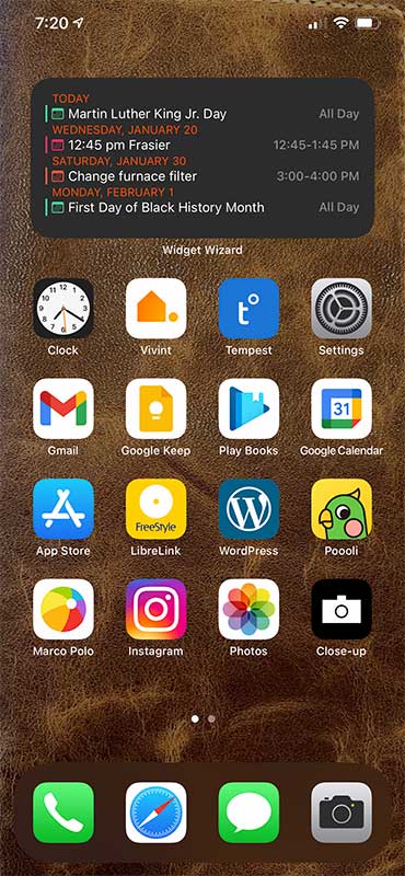
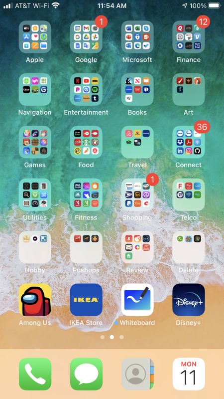
When we did this back in 2018, my daily phone was a Pixel 2 XL. Things have changed in the last 3 years because now I’ve back on the iOS team (at least for now) since last May. I play around with widgets and layout all the time, but here are the 2 home screens on my iPhone 12 Pro Max as they are right now. First of all, the background is a picture of a hand sewed leather journal cover that I made my sister for this past Christmas. You can even see a few of the stitches in the upper right corner 
I use the Widget Wizard app for the calendar widget at the top of the main home screen. I like the widget except for the title under the window. I wish I could turn that off.
I keep my most used apps on the main home screen. For my smartphone functions, there’s my Vivint smarthome security app and the Weatherflow Tempest weather station app. Then there’s a row of Google apps. Yes, even though I’m on an iPhone, I use Gmail and other Google services instead of Apple services.
On the next row is the LibreLink app for my Freestyle Libre 14 day glucose monitor, WordPress is an interface for The Gadgeteer, and the Poooli app is a little thermal printer that I’m currently reviewing.
On the last row we have my favorite chat app Marco Polo, then Instagram, Apple Photos, and an app called Close-up that I use to take a daily selfie. At the end of the year, I can make a movie/slideshow that show’s how I’ve changed.
The 2nd screen is a collection of folders holding all the other apps as I find that easier to use that the app library screen.
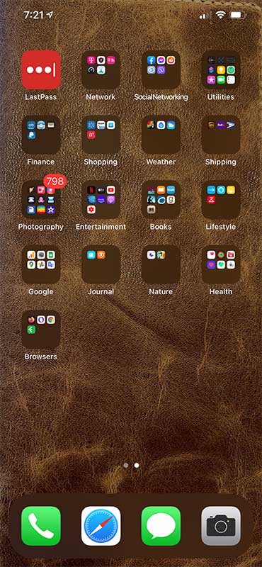
Smythe Richbourg
You’ll note that my screen has changed very little from the last time we did this. At that point, I only had three apps that were not in folders. Now I only have one – email. I have changed the background screen to be a picture of my wife wandering around in her natural habitat, a bird sanctuary. I find that the most used apps are things I can either get Siri to fetch for me, or they are two taps away in a folder. I’m don’t mind tapping twice. It’s a patience thing.
Garry Kolb
Here are the four screens on my Galaxy S20 Ultra. I have my five quick-access buttons on the bottom – calls, contacts, texts, email, Facebook. I like using folders to organize similar apps, but keep really often used ones out there on their own.
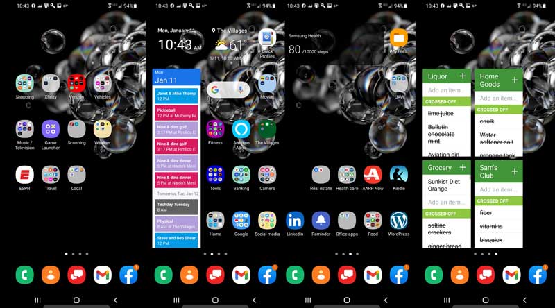
From left to right:
Utility screen – sports, weather, car, music, media, travel, etc
Main home screen – Most used items – banking, home automation, camera, social media, Google tools, fitness, etc
Less used tools – health care, office apps, restaurant apps, real estate, and so on
Shopping lists – ’nuff said
I have a ton of apps and actually use most of them. If I find that I have stopped using an app, I try to remember to uninstall it to keep unused junk from cluttering up the limited storage on my phone.
Dave Moore
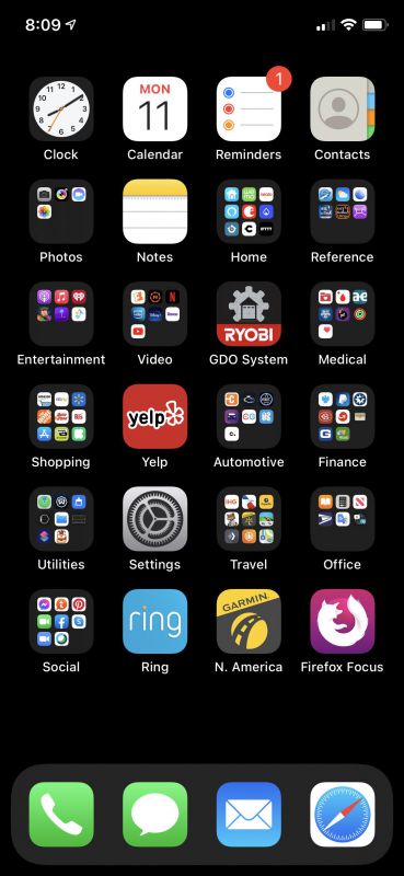
I love my iPhone XS, but I’m not a huge fan of swiping to get to what I need. I’ve organized my home screen so I can get to what I want in two clicks. Everything is accessible from the here – there are no more sorts to swipe to. Backgrounds are kept simple to try to reduce the cluttered feeling and I try to keep apps I don’t use from invading. It’s pedestrian, but it works for me.
Lex Strickland
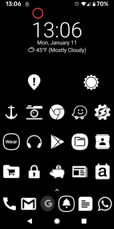
This is Nova Launcher on a Pixel 3a XL. I only use 1 screen. I like black & white. The icons are by ‘Whicons’. If B&W saves a little battery, cool, but the jury is out. The clock & weather widget is ‘Digital Clock Xperia’. The red circle at top is Floating Button, a multi-function button I use mainly for (short press) all volume controls (media, calls, ringer/notifications and alarm). It also does (long press) Restart or Power off.
Almost every icon has multiple apps under it and they are accessed by swiping the icon upwards. The top right sun icon is my 5 weather and 2 birding apps. I play drums so the headphones icon is everything music and audio related. The file folder icon has everything data related, like Google Keep, Google Docs, Google Sheets, Google Drive, Simplenote, Genius Scan, OneNote, etc. The shopping cart icon has Google Pay, Costco, Amazon, KeyRing (card keeper), and calculator. My calendar is ‘aCalendar’. In the Gear icon is Tasker and system settings. With Tasker I mostly automate multiple phone silent times and a few persistent reminder alerts. The anchor icon has Bible apps. The piggy bank icon is banking and the padlock icon is my VPN, Bitwarden, Authy authenticator and WyzeCam app. Cheers!
Kevin Judson
My current home screen and app organization is very much a ‘perfect is the enemy of good enough’ solution. When I was using an android phone, my inventory of applications could be grouped into background folders, and the home screen(s) could be configured with the bare minimum of important apps and information widgets. Taking useful actions quickly, and thoughtful organization of the apps could be nicely separated – this also helped when doing the yearly trimming of un-used and retired applications.
On the iPhone platform, I keep a primary home screen with the most-used and immediate applications. The second screen contains folders for organization. IOS has added the new feature of the App Library, which replicates the Android ‘Apps’ background organization & inventory. It has the possibility of keeping Apps and Folders in a workspace away from the home screen, but I have not gone this direction because it doesn’t allow any control over organization, folder naming, or order. It’s possible that I could switch to simple ‘searching’ for each secondary app that I need to use, but this feels like adding a middleman step every time I want to play with Garage Band, do a workout, or anything else that isn’t on the primary home screen.
Since Apps are automatically added to both the phone and the tablet, for anything new I have a ‘Review’ folder that reminds me to determine if it should persist. Also, a ‘delete’ folder that I use to remove apps from all devices and ‘hide’ from my app store.
I have also looked at the new feature of ‘widgets’ on the iPhone, to display information about weather, fitness or calendar on the home screen. The things that I would instantly check on are currently displayed on the watch screen, so I have reached a comfortable equilibrium between iPhone and iWatch with ‘information I need at a glance’ / ‘programs I want to access quickly from the home screen’ / ‘groups of programs I occasionally access on the second screen’.
Jacob Haas
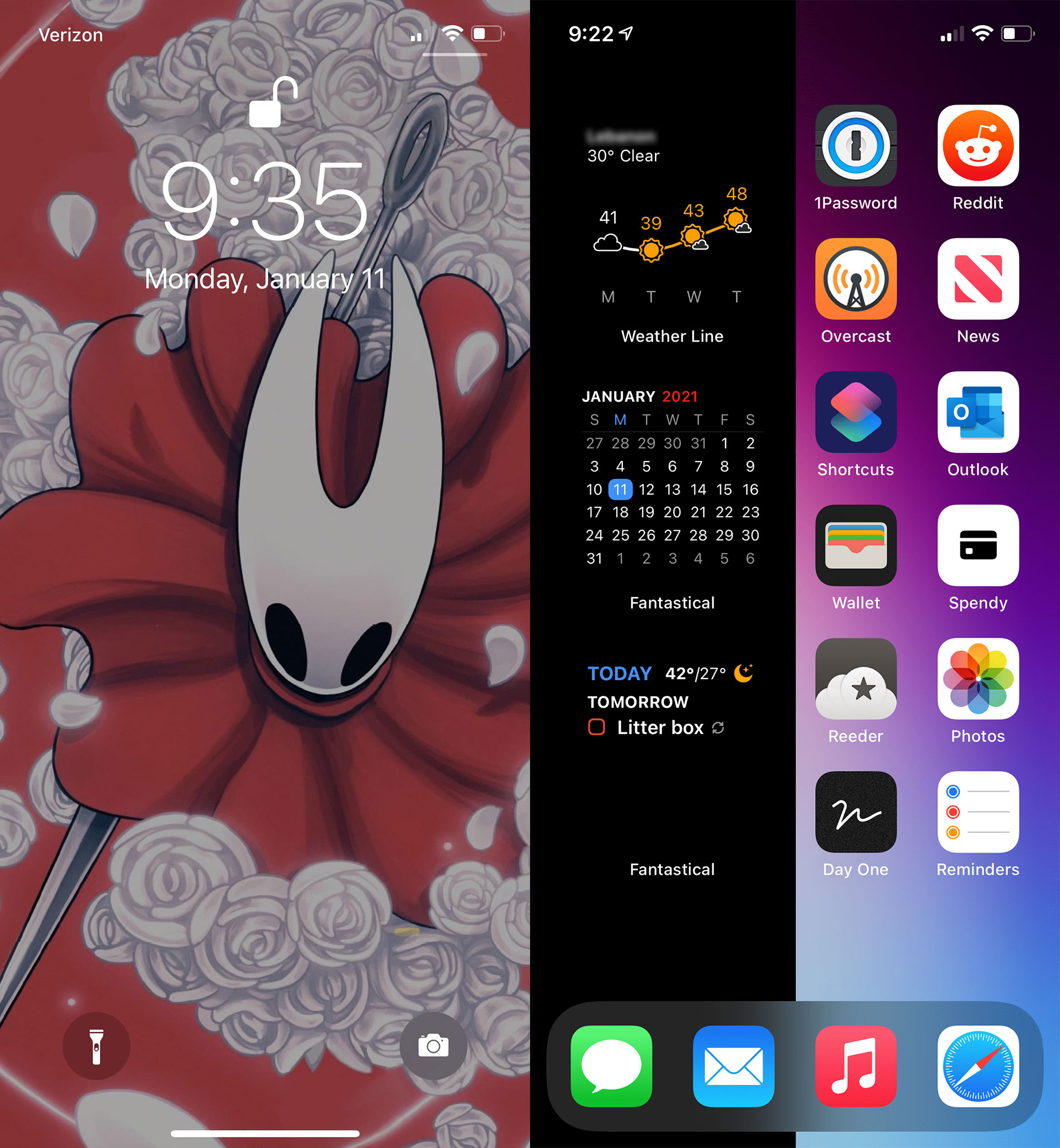
I tend to change my home screen configuration and wallpapers quite a bit, but with the introduction of widgets in iOS 14, I think I’ve found a 1-screen layout that I like.
My lock screen is some gorgeous artwork from the upcoming Hollow Knight sequel, Silksong.
The widgets on my iPhone 12 Pro’s home screen are from Weather Line and Fantastical, and give me a quick view of the weather, day of the month, and tasks/meetings. I have an hourly weather widget in the same “stack” as the daily weather widget.
The wallpaper I have on the home screen is pure black on the left half, which makes the pure black widgets blend right into the background. I wish Apple’s widgets would have more OLED-black options rather than the seemingly-arbitrary dark grays. They don’t even match the grays they use, it feels all over the place.
In my dock are the “normal” boring choices of Messages, Mail, Music and Safari.
And on the right side of the screen I have 12 of my most-used apps.
- 1Password for accessing paying bills and sensitive financial sites
- Reddit for guilty doom-scrolling
- Overcast is my favorite podcast app
- Apple News which I’ve spent a lot of time curating
- Shortcuts for all the stuff that’s not on my home screen that I need to access quickly
- Outlook, where I have all my work email and calendars
- Wallet to keep track of my spending
- Spendy is a nice little checkbook app
- Reeder 5 was a nice update for my favorite RSS reader
- Photos
- Day One for journaling
- Reminders… I’m still struggling with picking one unified task app, it’s not perfect but Reminders integrates so good with iOS and adding tasks or grocery items with Siri
Shawna Netser
On my iPhone XR, I like to keep all of my daily used apps on the home screen, with all the other apps organized in folders on my second page. Really nothing too exciting and generally it stays in this configuration. I do have our family calendar (Cozi) widget, battery status and random phone picture on the left screen as well. Simple, organized and efficient.
Matt Gregersen
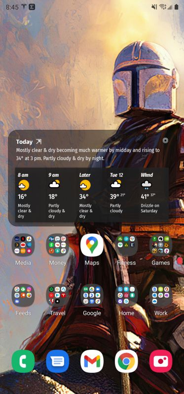
What can I say? I have things organized on my Galaxy Note 20 Ultra 5G (these phone names are getting as ridiculous as PC Monitor names) by topic on a single screen, along with weather, with a Mandalorian background. This is the way. I used to have multiple screens and widgets, but over time I’ve found that (like many of the other Gadgeteers) that keeping it simple makes me less stupid.
Steve Holt
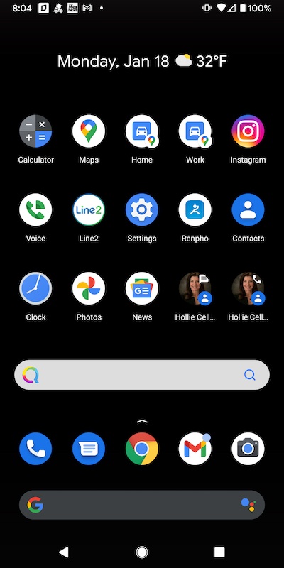
Probably the main reason I like Android phones is my ability to customize things in a much more comprehensive way than I could with an iPhone. So I am a big fan of widgets, and I usually move app icons around on a regular basis as my needs change. My phone is a Pixel 3a XL running Android 11, and I always have a black background because I don’t want anything cluttering up my view of the icons.
Across the bottom are the apps I use the most: phone, messages, Chrome, email, and camera. I have apps that typically stay all the time, like clock, calculator, Google Voice, and contacts. I love that Android lets me put shortcuts on the home screen to one-touch call my wife or one-touch send a text message to her. I also have shortcuts to one-touch Google Maps navigation to the 2 places I go every day: work and home. I have a weather widget at the top so I can see what the weather is when I wake up. And by default Android 11 on the Google Pixel has the Google search box at the bottom of the screen. But I am becoming more and more concerned with my privacy and I am losing trust in tech companies and what they are doing with my personal information, so I added a search widget for the Quant search engine that I am testing.
Part 2 coming soon!
Filed in categories: Articles
Tagged: gadgeteer
Gadgeteer team: Our 2021 mobile home screen setups (part 1) originally appeared on The Gadgeteer on January 18, 2021 at 9:00 am.
Note: If you are subscribed to this feed through FeedBurner, please switch to our native feed URL http://the-gadgeteer.com/feed/ in order to ensure continuous delivery.