

These goofy simplified NBA logos are deeply relatable
SO GOOD!
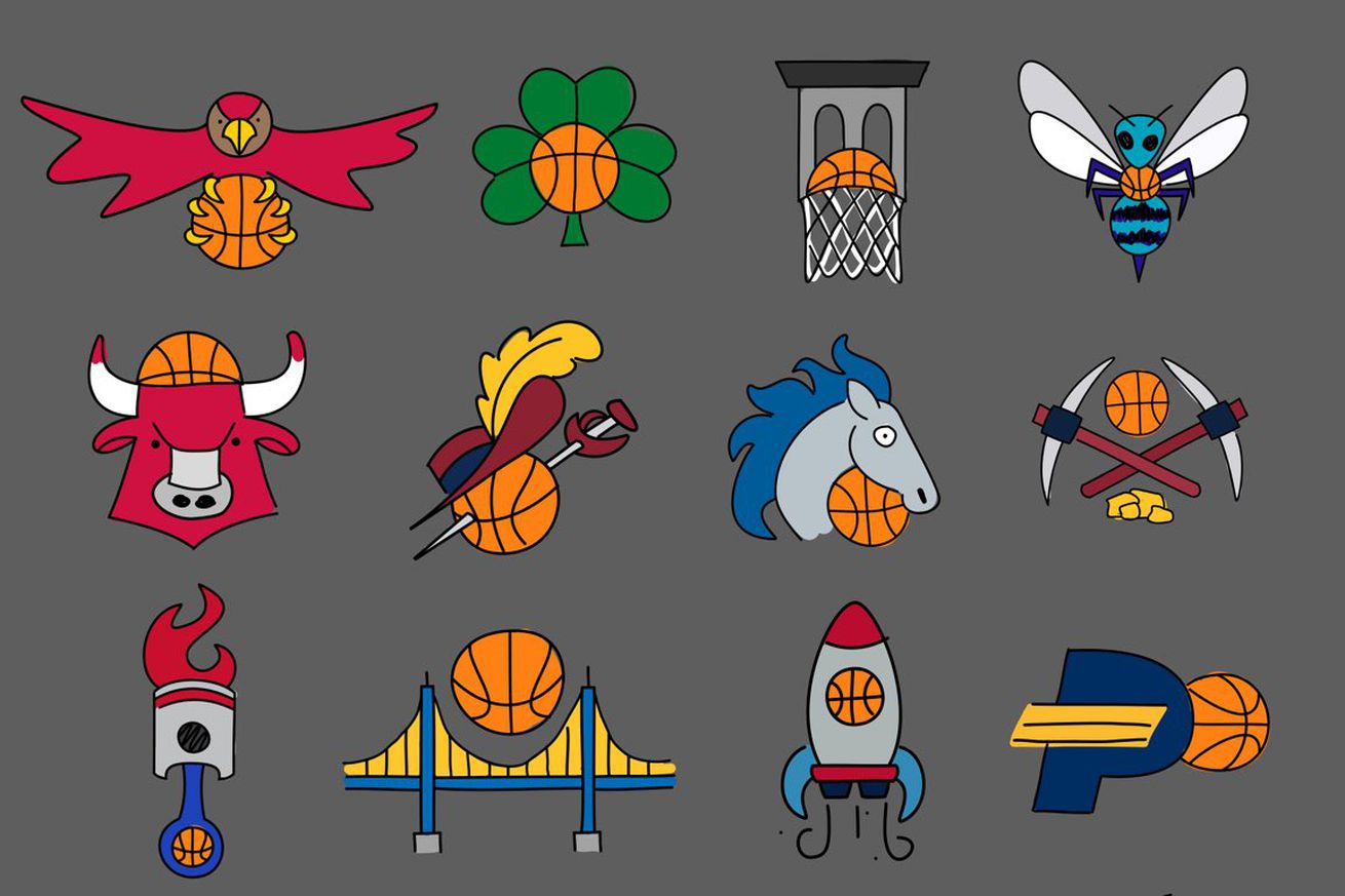
Every year we get a spate of logo redesigns, but this latest batch is really making us feel things. Calling these “kinda crappily drawn” undersells just how wonderful these logos are. These are perfection. Away from the starched shirts and perfectly designed brands of the NBA exists these beautiful, weird drawings that evoke strong “circa 2004 web comic vibes,” and we love them. In fact, we love them so much we felt the need to tell you why some of these logos mean so much to us.
Kinda crappily drawn #NBA logos pic.twitter.com/MkSTDvRaBE
— Dana (@greatdane92) October 19, 2020
Which of these mascots speak to us?
This Raptors mascot is me.
/cdn.vox-cdn.com/uploads/chorus_asset/file/21979525/Screen_Shot_2020_10_22_at_9.56.07_AM.png)
As a man with a penchant for emotional eating (especially during this pandemic) the redesigned Raptors mascot makes me feel things. This might as well be a snapshot of every time my wife finds me in the pantry sneaking a cookie after dinner. The Raptor knows he shouldn’t be eating a basketball, but he just can’t help himself. The surprised eye really sells it all.
I love this shame eating Raptor with all my heart.
— James Dator
This bull is what I look like watching sports.
/cdn.vox-cdn.com/uploads/chorus_asset/file/21979524/Screen_Shot_2020_10_22_at_9.41.49_AM.png)
This grumpy bull looks like he’s watching his own team play, and he perfectly portrays the exact mood I have often felt watching my own teams. Plus, he’s wearing a cute little basketball hat! I love him.
— Hayley Archer
This sun is just trying to keep it together
/cdn.vox-cdn.com/uploads/chorus_asset/file/21979552/Screen_Shot_2020_10_22_at_9.07.50_AM.png)
Listen, it’s been a bad year and that doesn’t need to be explained any further. All of us are just trying to get by. Sometimes you have to throw on sunglasses to cover up the pain and try to appear as composed as possible.
— Ricky O’Donnell
I relate to the snacking Pelican.
/cdn.vox-cdn.com/uploads/chorus_asset/file/21979516/Screen_Shot_2020_10_22_at_9.51.46_AM.png)
This Pelican looks exactly how I’ve felt for the duration of the pandemic. Constantly snacking, and always keeping snacks on deck. I’ve yet to be short on snacks. But the Pelican is also serving some side-eye, which could be directed at a number of things over the last seven months.
— Whitney Medworth
The Bucks logo is a glaring reminder of my past sins
It’s harder than you might think to draw things “kinda crappily.” The process requires a natural proclivity for knowing how much detail you can take away from a symbol before it becomes completely unrecognizable. A true master can balance on that razor-thin line between familiarity and abstraction and produce thrilling hieroglyphs.
I’m occasionally asked to toe this line as part of my job here at SB Nation. And as it happens, I’ve struggled in the past to adequately misrepresent this particular logo, and that’s why Dana’s version resonates with me so poignantly. For your viewing pleasure, I pulled up my version from a silly graphic I made last year and put the two side-by-side.
/cdn.vox-cdn.com/uploads/chorus_asset/file/21979675/bucks_bucks_bucks.png)
Now, I don’t claim to be a visual artist, but I was pretty proud of my rough approximation of what a deer looks like. Those are wiggly antlers, but they’re still unmistakably antlers. But now that I’ve gotten this reminder of how good a simplified logo can actually be, all I can think is: Shit. Shit. Shit. I forgot the nose.
— Syd Kennedy
The Cavaliers logo reminds me of happier times.
/cdn.vox-cdn.com/uploads/chorus_asset/file/21979677/Screen_Shot_2020_10_22_at_11.02.26_AM.png)
What can be happier than a good children’s book story? Since all of these drawings remind me of old throwback kids’ book illustrations I read in my childhood, I had to choose the Cavaliers logo. It looks like Robin Hood. Just look at that feather!
— Sydney Umeri
You can buy this NBA logo shirt from Etsy — which is what we’re all gonna do.