

The Letter C in Logos, Part I: the Block C
Throughout the many seasons of watching the Cleveland Indians/Tribe/future name, as well as the faithful posting on Covering the Corner/Let’s Go Tribe, there have been many a discussion regarding the logo for the team.
Most of the arguments regarding the logo predate the loss of Wahoo. But I have read consistently here about how bland and boring the current Block C logo is.
I personally like it, but I can understand why others do not. To me, it harkens back to the early days of the franchise, as well as the logo the team used on the cap prior to placing Wahoo back onto the cap in the late 80s (which does happen to coincide with my youth).
I did write a few fan posts regarding that topic way back in 2012.
A Sartorial Review of the Cleveland Cap - Part I – Home
A Sartorial Review of the Cleveland Cap - Part II – Road
A Sartorial Review of the Cleveland Cap - Part III – Logos
I still believe had the franchise kept the Block C from its inception and never deviated, instead of being bland and boring, most would change their minds and call it a classic, like the Tigers Olde English D is revered. But that isn’t the way it has panned out.
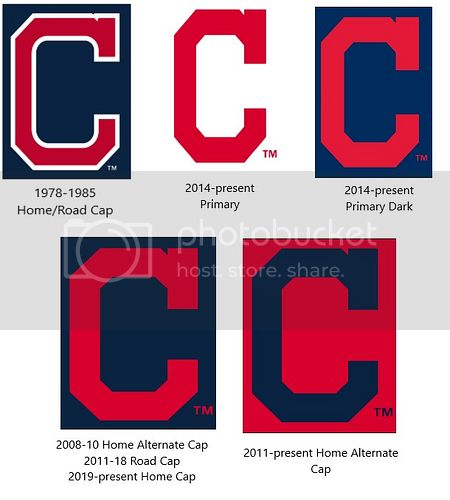
Interestingly enough the block C has been used in one format or another in a number of seasons. I have found evidence it was used from 1902-1920, 1978-1985 and 2011-present. Although the block C in the 1910s was much thinner than the original or current iterations.
First off I want to give many thanks to Chris Creamer’s SportsLogo.Net, where all of these images were culled from. There is a lot of information on his site and I highly encourage you to check it out
First we start with the current logo, the Block C.
Block C with a Notch: This has been in the following years for Cleveland: 1902-1904, 1915-1920, 1978-1985, and 2008-present
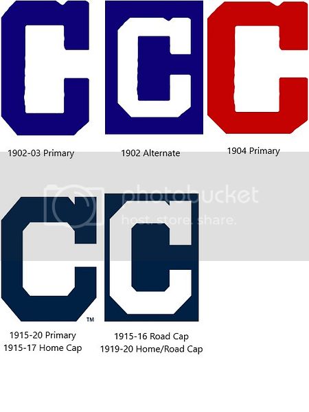
Block C without a notch was used from 1905-1920, 1929-32

Some of those were slimmer, but all looked fairly close in design.
However, while in the midst of another research project I have been working on, I have noted that Cleveland isn’t the only baseball team to use the Block C.
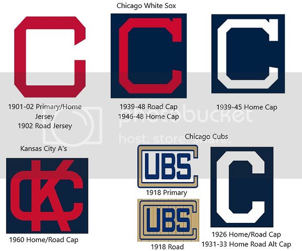
The White Sox used a slightly different Block version without a notch in 1901-1902. Then from 1939-1948 they used a thin Block C with a notch very similar to what Cleveland had used in the past.
The Cubs used a thicker Block C with no notch in 1926 and from 1931-1933. They technically used a Block C to surround the *ubs name in 1918, but that doesn’t match anything Cleveland tried.
Also, the Kansas City A’s in 1960 had a "squashed" Block C in their interlocking KC.
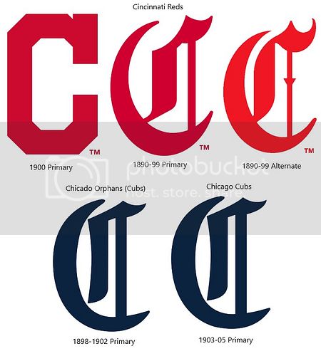
The only other MLB franchise I could find with a Block C was the Cincinnati Reds in 1900. This looks a lot like the version in 104, and the present rec Block C Cleveland uses.
Also in this image, I have included the Olde English C’s I found in this research, even though Cleveland never went that route. The Reds used two similar versions from 1890-1899, and the Orphans/Cubs used one that looks like the Tigers logo from 1898-1905.
I did look for other Block Cs across the other major sports (NFL, NBA. NHL) and the only one that has something close to a block C is the current LA Clippers logo that has the C surrounding LA.
Up next, Part 2: Round Cs